February 06, 2010
I question the validity of the claims about this chart
Somewhere Douchey McDouche Josh Marshall of TPM got hold of a chart showing the accelerating rate of job losses in the last year of the Bush presidency and the slowing rate of job losses in the first year of the Obama presidency.
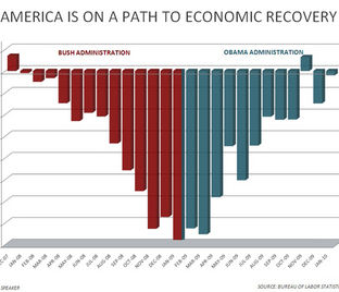
In his wisdom he has pronounced this as proof that the economy is recovering. I question that assertion. My personal interpretation is that job losses have slowed because employers are having to look harder for someone to fire. But hey maybe that's just me. I think the more important number would be unemployment. Look at the chart - It's a bell shaped distribution so if you had no other context you would assume that we are back where we started in 2008. 5% unemployment. Instead we are twice that with no real signs of that changing soon.
Comments are disabled.
Post is locked.
In his wisdom he has pronounced this as proof that the economy is recovering. I question that assertion. My personal interpretation is that job losses have slowed because employers are having to look harder for someone to fire. But hey maybe that's just me. I think the more important number would be unemployment. Look at the chart - It's a bell shaped distribution so if you had no other context you would assume that we are back where we started in 2008. 5% unemployment. Instead we are twice that with no real signs of that changing soon.
Posted by: chad98036 at
06:06 PM
| Comments (4)
| Add Comment
Post contains 149 words, total size 1 kb.
13kb generated in CPU 0.743, elapsed 0.738 seconds.
62 queries taking 0.3826 seconds, 145 records returned.
Powered by Minx 1.1.6c-pink.
62 queries taking 0.3826 seconds, 145 records returned.
Powered by Minx 1.1.6c-pink.